Have you ever looked at a flyer or an Instagram post and felt that something was just… off?
The spelling is correct, the picture is clear, but your eye is confused.
In Nigerian slang, we would say the design just looks “somehow.”
Usually, it’s not because the designer used the wrong software. It’s because they broke the Principles of Design.
Design isn’t just “sprinkling decoration” to make things look fine. It is engineering for the eyes. If you want your visuals to look professional and expensive, you need to follow rules.
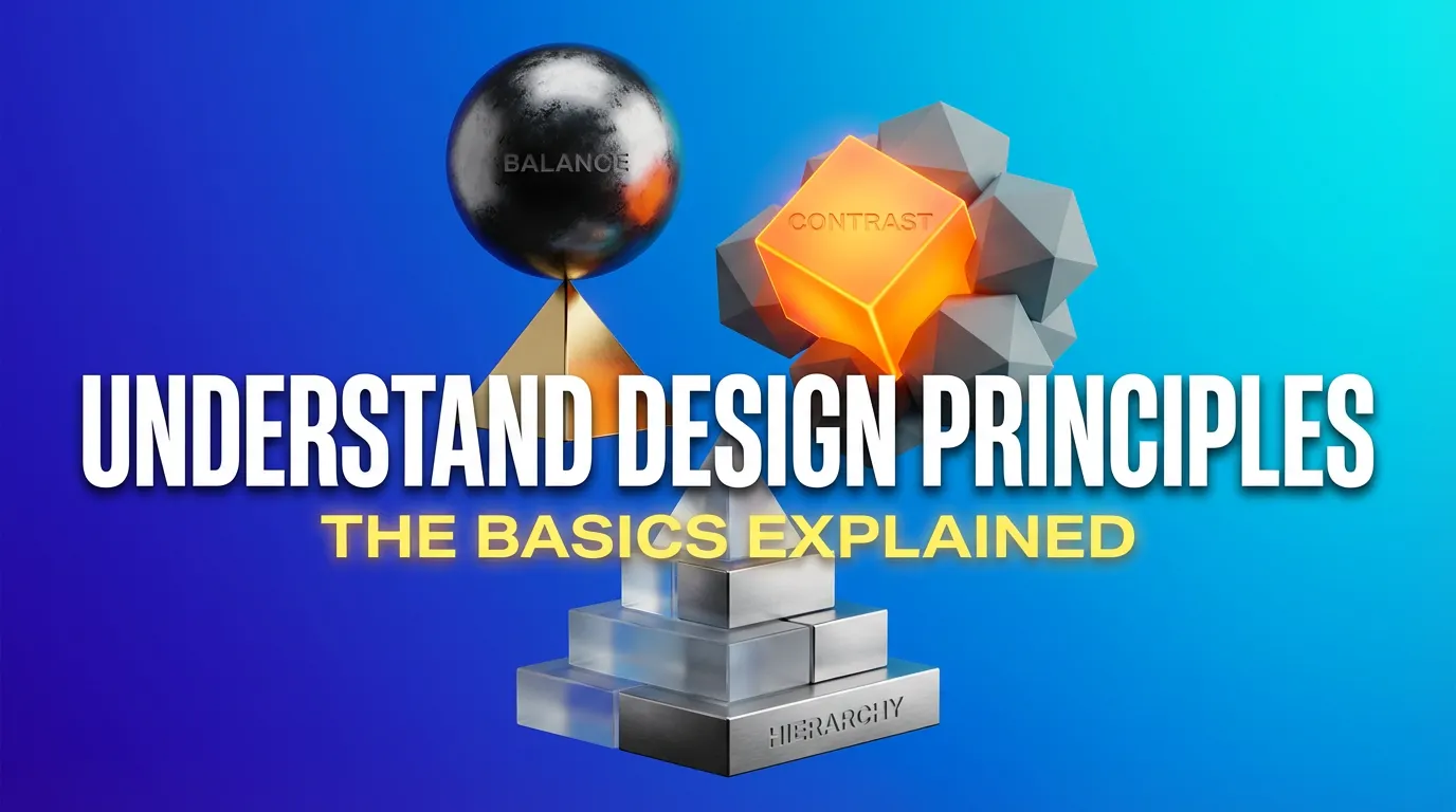
1. Hierarchy (The “Oga at the Top”)
In a Nigerian family meeting, you know who the elders are and who the children are. You don’t treat everyone the same. Design is the same.
Beginners often make the mistake of making everything big, the logo, the phone number, the headline. But if everything is shouting, nobody is listening.
The Rule: Decide what is most important (the “Oga”) and make it the biggest. Guide the viewer’s eye: Read this first, then look here.
2. White Space (The “VIP Section”)
This is the hardest one for clients to accept. They often say, “Ah, there is empty space here, let us add more pictures to maximize the money!”
But think about the difference between a crowded Balogun Market and a luxury hotel lobby.
• The market is packed tight and feels stressful.
• The hotel has wide-open spaces and feels expensive.
The Rule: White space is not “empty” space; it is breathing room. Space equals luxury. Don’t clutter your design.Here is the “secret sauce” broken down in plain English.
3. Contrast (The “Pop” Factor)
Contrast is what makes people stop scrolling. It is about opposites.
If you write yellow text on a white background, nobody can read it. That is low contrast. But put that yellow text on a black background? Boom. It pops.
• The Rule: Use high contrast (Dark vs. Light, Big vs. Small) to make your “Buy Now” button or headline impossible to ignore.
4. Balance (The Seesaw)
Imagine you are serving food at a buffet. If you pile all the rice, meat, and dodo on just the left side of the plate, the plate will tip over.
Design has “weight” too. If you put all your text and images on the left side of the flyer and leave the right side empty, the design feels unstable and makes the viewer uncomfortable.
The Rule: Distribute the elements so the layout feels stable.
5. Repetition (The “Aso Ebi” Effect)
Why do we wear Aso Ebi? To show Unity and Identity.
If you see a specific dark yellow, you think “MTN.” They own that color because they repeat it everywhere.
The Rule: Consistency builds memory. Don’t use a curly font today and a block font tomorrow. Repeat your colors and fonts until people recognize your brand without even reading the name.
6. Alignment (The Grid)
Nothing makes a design look “cheap” faster than scattered elements. When text and pictures are just dropped anywhere, it tells the viewer: “This person is disorganized.”
The Rule: Create an invisible line and stick to it. Align your text. Align your images. A structured design feels professional and trustworthy.
The Bottom Line
Great design is invisible. When these rules are followed, the viewer doesn’t notice the design, they just understand the message. But when you break them, that’s when things look “somehow.”
So, before you post that next graphic, ask yourself: Is there breathing room? Is it balanced? Is there a clear ‘Oga at the top’?
Mastering these basics is what separates the amateurs from the pros.